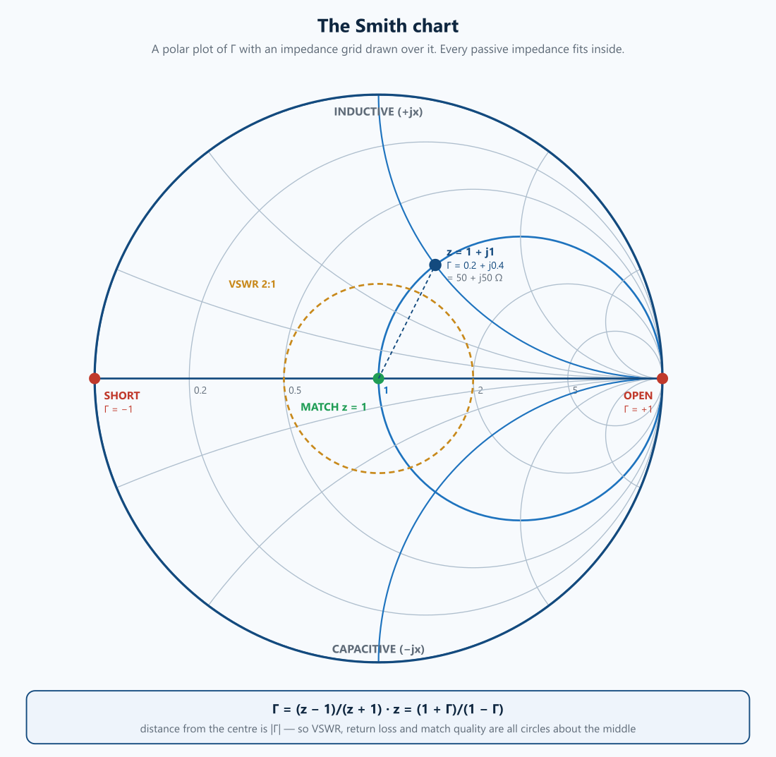
A companion to the S-parameters and Touchstone primer. That post covers what reflection data means numerically; this one covers reading it graphically — which is still how matching gets designed.
Phillip Smith drew his chart in 1939 to avoid doing complex arithmetic by hand. Every reason he invented it has been obsolete for forty years, and every RF tool still puts one on screen. That is worth explaining, because it is not nostalgia: the chart survives because it makes the structure of a matching problem visible in a way a table of numbers does not.
1. What it actually is
The chart is a conformal map. It takes the normalised impedance plane and maps it onto the reflection-coefficient plane:
Two facts make it useful:
- The entire right-half impedance plane — every physically realisable passive impedance, with positive resistance — maps inside the unit circle. An infinite plane becomes a finite disc.
- Circles map to circles. Lines of constant resistance and constant reactance in the plane become circles and arcs in the plane. That is what you see printed.
So the Smith chart is a polar plot of with an impedance grid drawn over it. Everything else follows from that one sentence.
Normalising
Everything is in units of the reference impedance, so the same chart works for any system:
| (in a 50 Ω system) | |
|---|---|
| 50 Ω | 1.000 |
| 100 Ω | 2.000 |
| 25 Ω | 0.500 |
| 75 Ω | 1.500 |
| 50 + j50 Ω | 1.000 + j1.000 |
| 30 − j40 Ω | 0.600 − j0.800 |
2. The grid
Constant-resistance circles all pass through the right-hand point () and shrink as grows. is the outer boundary; passes through the centre; is the right-hand point itself.
Constant-reactance arcs also converge on . The upper half is inductive (), the lower half capacitive (), and the horizontal axis is purely resistive.
To read a point: find which resistance circle and which reactance arc it sits on, and you have . Multiply by for the actual impedance.
3. The landmarks worth memorising
| Position | Meaning | ||
|---|---|---|---|
| Centre | 0 | 1 | perfect match — where you are trying to get to |
| Far left | −1 | 0 | short circuit |
| Far right | +1 | ∞ | open circuit |
| Top half | — | inductive | |
| Bottom half | — | capacitive | |
| Outer circle | purely reactive | total reflection, no loss |
Two of these do the most work. The centre is the target — matching is literally the act of moving a point to the middle. And distance from the centre is the only thing that matters for match quality: is the radius, so all the derived figures are circles centred on the middle of the chart.
| VSWR | (radius) | Return loss |
|---|---|---|
| 1.05 | 0.024 | 32.3 dB |
| 1.1 | 0.048 | 26.4 dB |
| 1.2 | 0.091 | 20.8 dB |
| 1.5 | 0.200 | 14.0 dB |
| 2.0 | 0.333 | 9.5 dB |
| 3.0 | 0.500 | 6.0 dB |
A “VSWR 2:1 circle” is just the circle of radius 0.333. When a datasheet says a device is matched to 2:1 over a band, it is saying the trace stays inside that circle.
Reading the inverse direction, which is what you do with measured data:
| (50 Ω system) | ||
|---|---|---|
| 0 | 1.000 | 50 Ω |
| +0.333 | 2.000 | 100 Ω |
| −0.333 | 0.500 | 25 Ω |
| 0.2 + j0.4 | 1.000 + j1.000 | 50 + j50 Ω |
| −1 | 0 | short |
| +1 | ∞ | open |
4. Moving around it
This is where the chart earns its keep. Each component type moves a point along a predictable path:
| Action | Movement |
|---|---|
| Series inductor | clockwise along a constant-resistance circle (reactance more positive) |
| Series capacitor | anticlockwise along a constant-resistance circle |
| Shunt inductor | anticlockwise along a constant-conductance circle |
| Shunt capacitor | clockwise along a constant-conductance circle |
| Length of transmission line | clockwise around a circle centred on the chart centre |
The last one is the elegant part. Adding line length rotates you at constant — a lossless line changes the phase of the reflection but not its magnitude. A full rotation is half a wavelength, which is why the chart’s outer rim is marked in wavelengths and why “toward generator” is clockwise.
It also explains something that confuses people first time: a lossless line transforms impedance. A 50 Ω load on a 50 Ω line stays at the centre and nothing happens; anything else sweeps around a circle, so the impedance you see at the input depends on how far away the load is. A quarter-wave line rotates you half way round — which is precisely the quarter-wave transformer:
| Match | Required |
|---|---|
| 100 Ω to 50 Ω | 70.711 Ω |
| 25 Ω to 50 Ω | 35.355 Ω |
| 75 Ω to 50 Ω | 61.237 Ω |
| 200 Ω to 50 Ω | 100.000 Ω |
5. Impedance, admittance, and why there are two charts
Series components are easy on an impedance chart; shunt components are easy on an admittance chart, where you add instead. The admittance chart is the impedance chart rotated 180°.
Real matching networks mix series and shunt elements, so you need both. Two approaches:
- The immittance chart overlays both grids in different colours — the usual choice in software.
- Rotating the point by 180° converts to on a single grid, which is what you did on paper.
The practical consequence: an L-network match is two moves — one along a resistance circle, one along a conductance circle — and on the chart you can see immediately whether a given topology can reach the centre at all, and which of the (usually two) solutions has the lower Q.
6. The other circles drawn on it
The chart is a canvas, and the contours people draw on it are where the real design happens:
Constant-Q arcs. Curves of constant . A matching network’s path bulges toward the chart edge; the further it bulges, the higher the Q and the narrower the bandwidth. Staying inside a Q arc is how you design for bandwidth rather than just for a spot frequency.
Stability circles. For a potentially unstable amplifier (see part three), these bound the source and load impedances that will cause oscillation. Keeping your design impedance outside them across all frequencies, not just the band of interest, is the actual stability criterion.
Constant-noise-figure circles. The source impedance for minimum noise, , is generally not the conjugate match for maximum gain. Noise circles and gain circles drawn together show the trade explicitly, and choosing a point between them is LNA design.
Load-pull contours. Measured or simulated curves of constant output power and constant efficiency against presented load. A power amplifier’s optimum load is emphatically not the conjugate match, and load-pull contours are how it is found.
All four of these are the same idea: a region of the plane where some property holds. That is the thing a table of numbers cannot show you, and it is why the chart outlived the arithmetic it was invented to avoid.
7. Reading a real trace
A measured sweep is a path, not a point — frequency is the parameter along it. Things to read off it:
- How close it comes to the centre, and at what frequency, is where the device is matched.
- Loops mean resonances. The size of a loop is how strongly it resonates.
- The overall clockwise winding is electrical length — a long fixture in front of the device spins the trace around many times. This is one way to spot that a calibration plane is in the wrong place: the device itself should sit near the centre-ish region, not spiral endlessly.
- A trace outside the unit circle means : either an active device that is reflecting more than it receives (potentially unstable), or bad data.
8. Why it survives
Software computes matches instantly. The chart persists because:
- It makes trade-offs visible. Bandwidth, Q, gain and noise are regions, not numbers, and regions are seen not read.
- It shows the whole solution space at once, so you can tell whether a topology is even capable of reaching the target before optimising.
- It is the common language. Every VNA, every simulator and every datasheet uses it, so reading one is not optional.
- It makes errors obvious. A trace winding many times, or leaving the unit circle, is visibly wrong in a way a column of numbers is not.
The arithmetic it was invented to avoid is genuinely obsolete. The geometry is not.
Where we fit
Matching, measurement and correlation are part of the board and RF work we do — designing the structures, measuring them on a VNA, and reconciling the two when they disagree. If you have a match that will not hold across the band, or a measurement whose trace does not look like the model, that is the conversation we like having.
Glossary
Admittance chart (Y-chart) — The impedance chart rotated 180°, because . Shunt components add directly on it, the way series components add on the impedance chart. Matching is mostly the act of flipping between the two grids: series element, rotate 180°, shunt element, rotate back. Get the flip wrong and your L-network moves the point the opposite way round the chart.
Conformal map — A transformation that preserves angles. is a Möbius transform, and Möbius transforms map circles and lines to circles and lines — which is the entire reason the chart works. Every constant-resistance line in the impedance plane becomes a circle on the chart, and nothing has to be plotted point by point.
Constant-Q arc — Locus of constant , the loaded Q of the impedance at that point. Arcs bow outward from the centre; the further your matching path strays onto a high-Q arc, the narrower the resulting match. A two-element L-network has no choice about the Q it passes through — that is set by the transformation ratio — which is precisely why broadband matching needs three elements or more.
Constant-resistance / constant-reactance circles — The two families that make up the grid. Constant- circles are all tangent at the open-circuit point on the right; constant- arcs run off that same point. Series L moves you clockwise along a constant- circle, series C anticlockwise. Memorising which way round is most of the practical skill.
Immittance chart — Impedance and admittance grids overlaid on one page, so an L-network can be walked without mentally rotating. What almost every simulator draws by default. Cluttered to read by eye, which is why the two separate charts survive in teaching.
Load-pull contour — Constant output power, or constant PAE, plotted against the load actually presented to a device. Unlike the rest of the chart these are measured or simulated, not derived — a power amplifier’s optimum load is not the conjugate match (see the PA page), so it cannot be computed from . The contours’ spacing is the useful part: it tells you how much performance a given load error costs.
Normalised impedance — , what the grid actually plots. Everything on the chart is dimensionless, which is why one chart serves 50 Ω, 75 Ω and 100 Ω differential work. It is also the commonest beginner error: reading 1.0 at the centre as “1 ohm” rather than ““.
Reflection coefficient — , the complex number the chart is a picture of. Magnitude is how much comes back, angle is the phase it comes back with. The chart is simply the plane with an impedance grid drawn on top.
Stability circle — The boundary of source or load impedances that would make an amplifier oscillate. The useful question is not whether the circle exists — for most devices with gain it does — but whether it encloses any impedance your circuit can actually present, at any frequency, including with an unknown length of cable attached. A receive LNA whose antenna can be disconnected sees every phase on the unit circle.
Toward generator / toward load — Clockwise and anticlockwise. Adding transmission line between the load and your observation point rotates clockwise, and a half wavelength is one full turn — which is why impedance repeats every and why a line length is a matching component in its own right.
Unit circle — : the chart’s boundary and the edge of passive realisability. Anything outside it reflects more than it received, so measured data that strays outside is a calibration error, a de-embedding error, or a genuinely active device — never a passive component behaving oddly.
VSWR circle — A circle centred on the chart centre; every point on it has the same match quality. Handy as a target: “stay inside the 1.5:1 circle across the band” is a specification you can draw, and a matching network’s trajectory either stays inside it or does not.
Further reading — reference books
Book links below are Amazon affiliate links: if you buy through one we earn a small commission at no extra cost to you. It does not influence what is recommended — the same books were on this list before the links were.
- David Pozar, Microwave Engineering — the derivation and the classic treatment.
- Guillermo Gonzalez, Microwave Transistor Amplifiers: Analysis and Design — stability, gain and noise circles in depth.
- Chris Bowick, RF Circuit Design — the most approachable practical introduction to matching.
- Randall Rhea, Discrete Oscillator Design.
- Joel Dunsmore, Handbook of Microwave Component Measurements — reading real traces.
Have a match that will not hold, or a trace that does not look like the model? That’s what we do. Reach us at circuit-design.space.
circuit-design.space · +1-971-357-1400 · anovickis@circuit-design.space